Would you like visitors on mobile devices to get a better experience when viewing PDFs on your site?
In this guide, we’ll walk you through setting up the mobile display settings in PDF Embedder, so you can control how embedded PDFs behave on smaller screens.
All you need is PDF Embedder Premium installed and activated on your WordPress site.
Requirements: Mobile display settings require a paid license level or higher.
Before you get started, make sure PDF Embedder is installed and activated on your WordPress site.
Setting the Mobile Width Breakpoint
To get started, we’ll open the PDF Embedder settings and navigate to the Mobile tab.
From your WordPress admin sidebar, go to Settings » PDF Embedder.
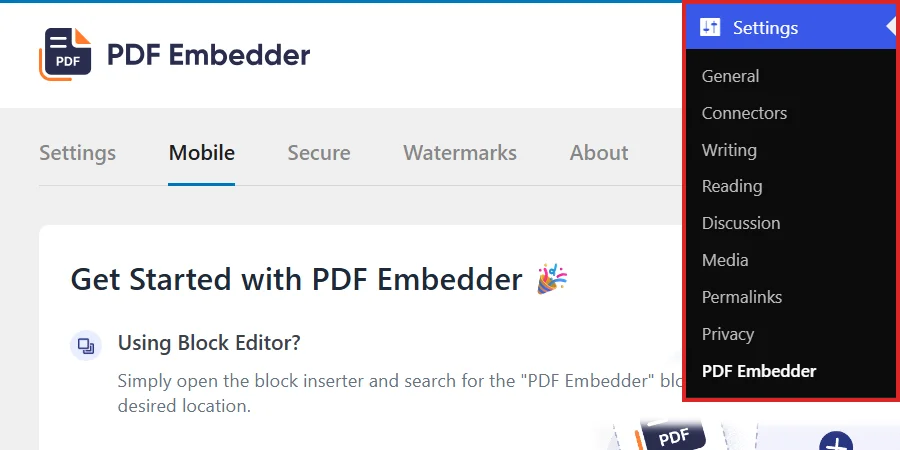
Once the settings page opens, click the Mobile tab.
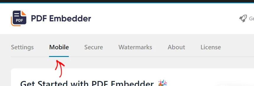
The Mobile tab shows the settings you’ll use to control how PDFs display on smaller screens.
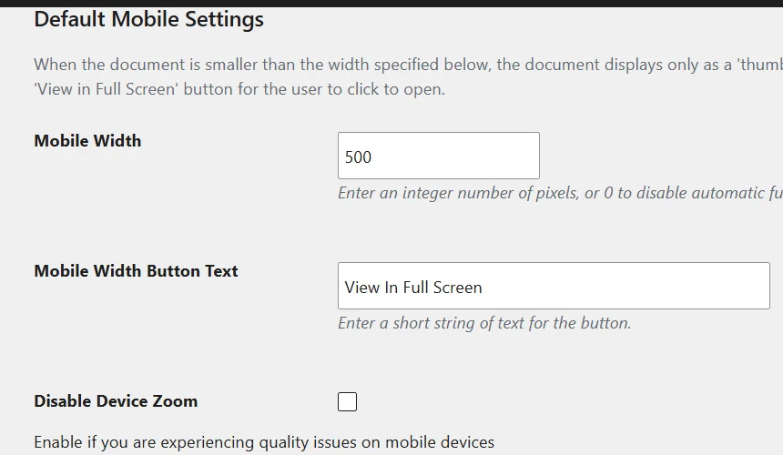
The Mobile Width field sets the pixel width below which the embedded viewer switches to mobile mode. When a visitor’s screen is narrower than this value, PDF Embedder displays a fullscreen button instead of rendering the PDF inline. The default value is 500 pixels.
Next, enter the pixel width that works for your site’s layout. For most sites, a value between 400 and 600 pixels works well.
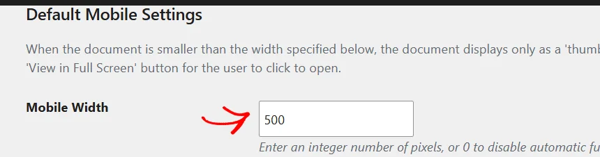
A lower number means the fullscreen button appears less often. A higher number means more visitors will see the button rather than an inline viewer.
Once you’ve chosen a mobile width value, you’re ready to set up how the fullscreen button is labeled.
Customizing the Fullscreen Button Text
The Mobile Width Button Text field controls the label on the button that appears when a visitor’s screen is below the mobile width threshold. By default, the button reads “View In Full Screen.”
You can replace this text with anything that fits your site’s tone, such as “Open PDF” or “View Document.”
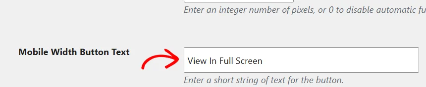
This section is now set up. Next, you can control whether mobile browsers auto-zoom when visitors interact with an embedded PDF.
Disabling Device Zoom
The Disable Device Zoom checkbox prevents mobile browsers from auto-zooming when visitors interact with an embedded PDF. It is unchecked by default. Checking it prevents an unexpected zoom that takes over the screen and makes navigating back to the page difficult.
To prevent auto-zoom on mobile, check the Disable Device Zoom box.
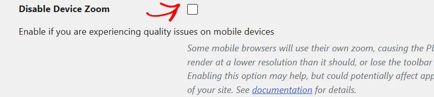
When you are done, click Save Changes at the bottom of the form.
That’s it! Your mobile display settings are now saved. Visitors on smaller screens will see the updated behavior when they view embedded PDFs on your site.
Now that your mobile settings are saved, you may want to customize how the viewer looks and behaves.
See Configuring PDF Embedder Viewer Settings to get started.
Frequently Asked Questions
Below, we’ve answered some of the most common questions about PDF Embedder’s mobile display settings.
What happens if a visitor’s screen is exactly the width I set for Mobile Width?
The mobile mode triggers when the embedded viewer is narrower than the Mobile Width value. A viewer exactly at that width displays inline, not as a button.
Does the Disable Device Zoom setting affect my whole page, or only the PDF?
It affects the entire page, not just the PDF viewer. Enable it only if unexpected zoom from the PDF viewer is causing a poor experience. Otherwise, leave it unchecked to preserve normal browser zoom behavior for your visitors.